Documentation Index
Fetch the complete documentation index at: https://architect-d889a35e-sync-pr-2896.mintlify.app/llms.txt
Use this file to discover all available pages before exploring further.
Slices are the building blocks of an Architect page. Think of them as reusable page components (text, images, tables, testimonials, CTAs) that the agent assembles into a full page based on your page context.
TextContainer
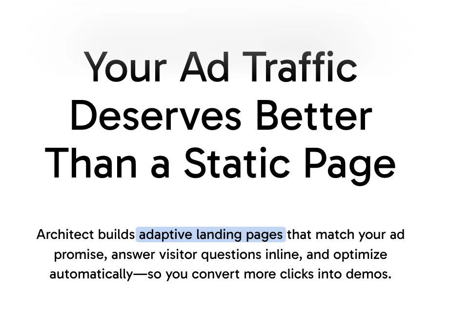 Best Used For: Rendering formatted text content with markdown support including headings, bold, italic, links, lists, and inline code. Supports [keyword] highlighting for interactive elements. This is the foundational component for any text-heavy content.
ImageContainer
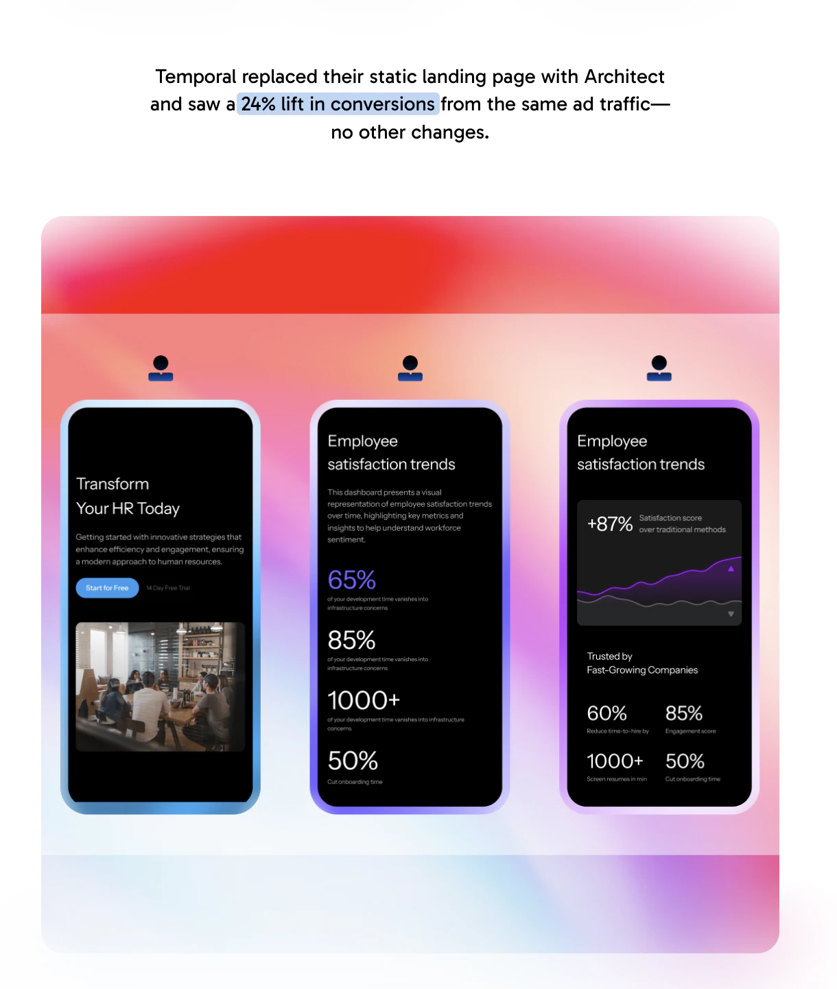 Best Used For:
Displaying responsive images with optional alt text for accessibility. Supports size variants:
Best Used For:
Displaying responsive images with optional alt text for accessibility. Supports size variants:
- small: 60% width, centered
- medium: 100% width (default)
- large: 60vw (breaks out of container)
- full: 100vw (full bleed)
Table
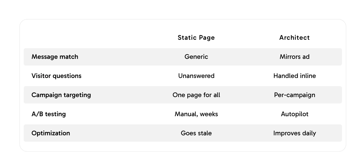 Best Used For: Organizing and displaying structured, tabular data with column headers and rows. Ideal for pricing comparisons, feature matrices, specifications, or any two-dimensional data that benefits from a grid layout with striped rows and hover effects.
FeatureCards
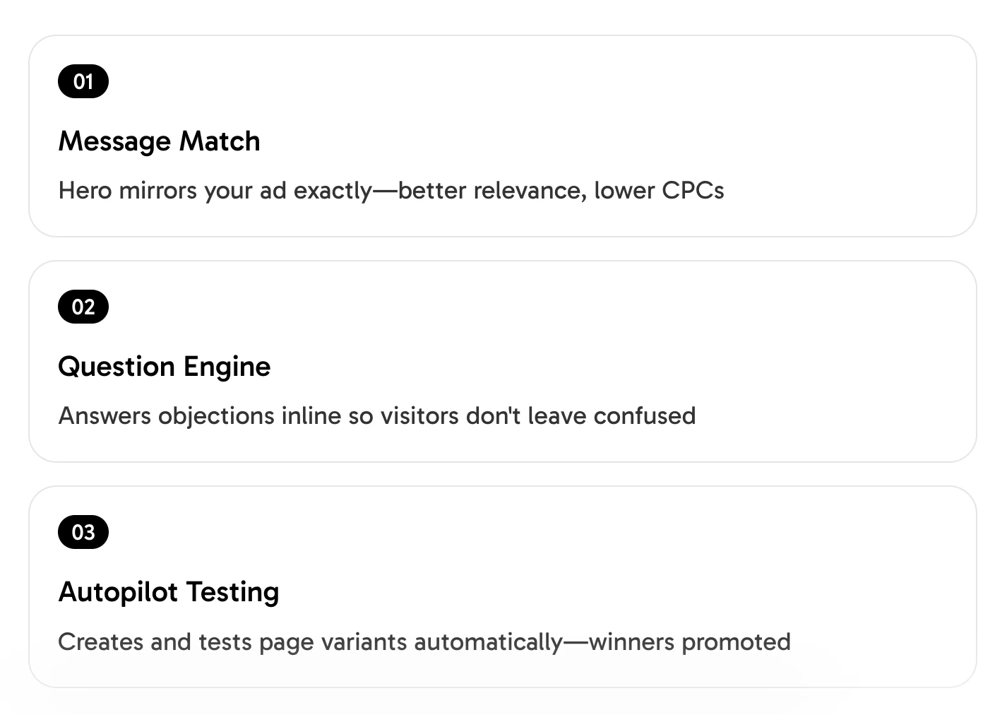 Best Used For:
Presenting
2-6 features, benefits, or value propositions
in a scannable card grid layout (up to 3 per row). Each card contains:
Best Used For:
Presenting
2-6 features, benefits, or value propositions
in a scannable card grid layout (up to 3 per row). Each card contains:
- Headline (2-5 words)
- Content description (1-2 sentences)
- Optional icon
- Optional feature image (placeholder
{ category: "product" | "brand" } or resolved image asset)
Supports imageMode: fill (photos) or contain (diagrams/logos).
TestimonialCarousel
 Best Used For:
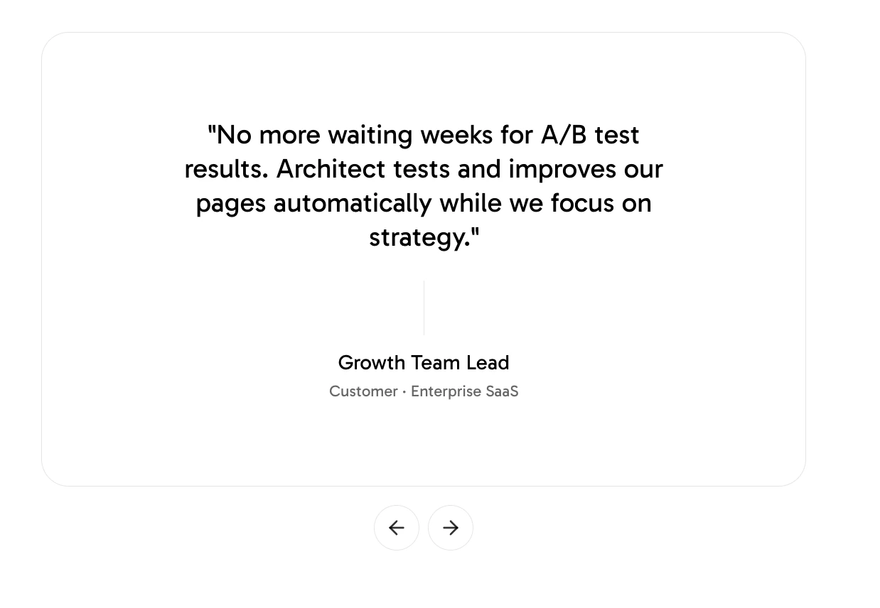
Adding social proof through rotating customer testimonials displayed as a horizontal carousel with quote styling. Each testimonial includes:
Best Used For:
Adding social proof through rotating customer testimonials displayed as a horizontal carousel with quote styling. Each testimonial includes:
- Quote text (15-40 words, customer’s voice)
- Author name
- Optional title/role
- Optional company name
Includes navigation dots for multiple testimonials.
CallToActionCard
 Best Used For:
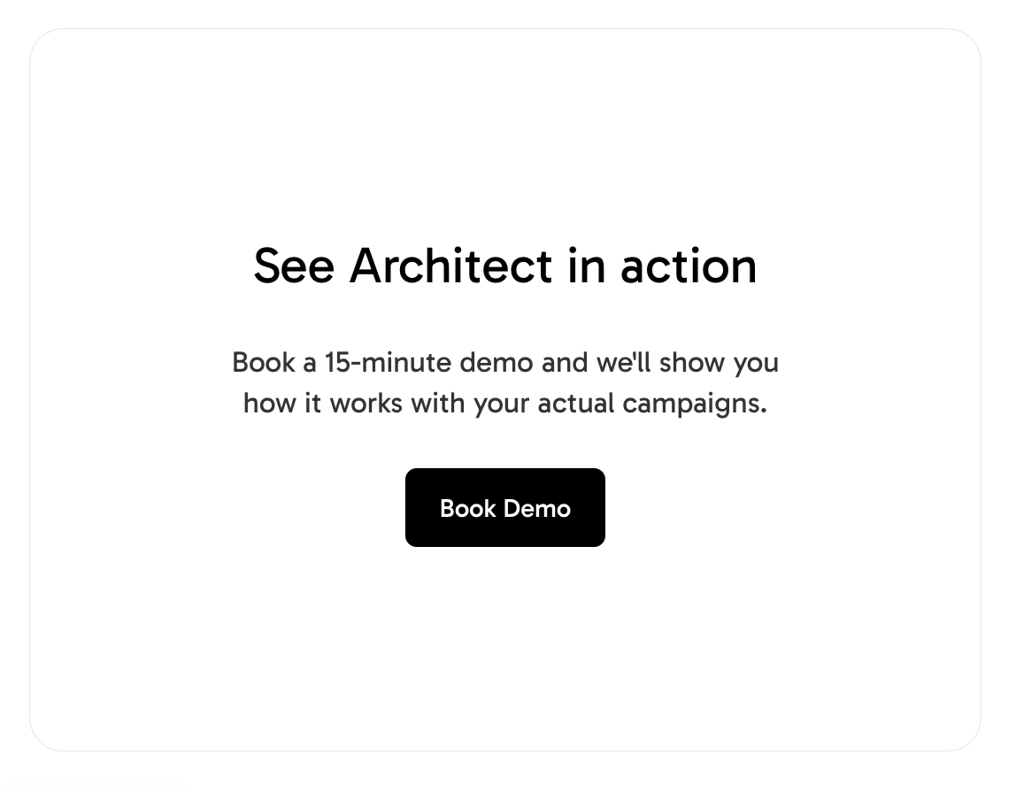
Creating a prominent conversion point with a bold headline (5-10 words), supporting description (1-2 sentences), and an action button. Actions can be:
Best Used For:
Creating a prominent conversion point with a bold headline (5-10 words), supporting description (1-2 sentences), and an action button. Actions can be:
- open-url: Navigate to a URL
- form: Open an email capture form modal
StatsCards
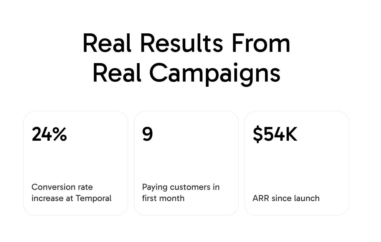 Best Used For: Displaying 2-4 highlighted statistics as large, prominent numbers with labels. Builds credibility by making abstract benefits tangible (e.g., “10K+” Active Users, “99.9%” Uptime, “$2M” Revenue Generated). Values can include formatting characters.
LogoMarquee
 Best Used For: Building trust and credibility through a continuously scrolling banner of customer/partner logos (similar to “Trusted by…” sections). Logos are displayed with a grayscale filter for visual consistency. Supports speed control and per-item duration for fine-tuning.
Frame
 Best Used For:
Creating collapsible, expandable sections that organize related content under a header title. Frames can contain child components and are ideal for:
Best Used For:
Creating collapsible, expandable sections that organize related content under a header title. Frames can contain child components and are ideal for:
- FAQ-style expandable sections
- Progressive disclosure of detailed information
- Grouping related content with show/hide functionality
Properties: id, title, collapsible, defaultOpen.
FrameList
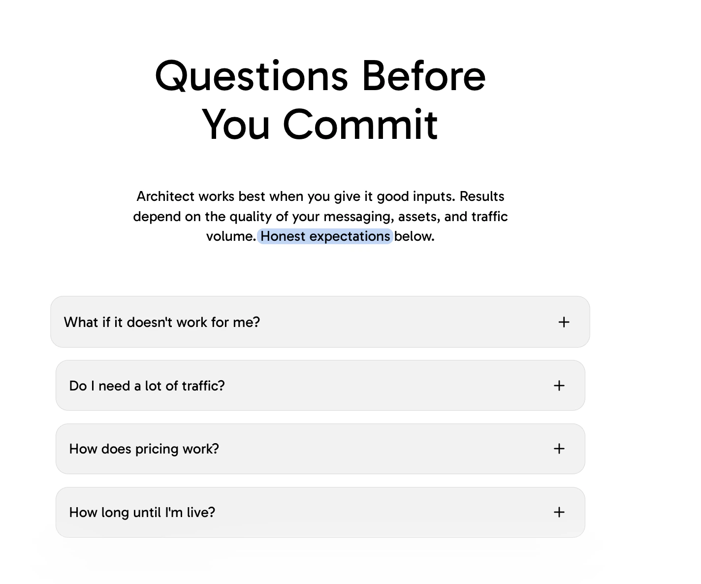 Best Used For: Grouping multiple Frame components with tighter spacing. Use when frames should appear closer together as a cohesive unit (e.g., a series of FAQ items or related expandable sections).
Threads (previously Branching)
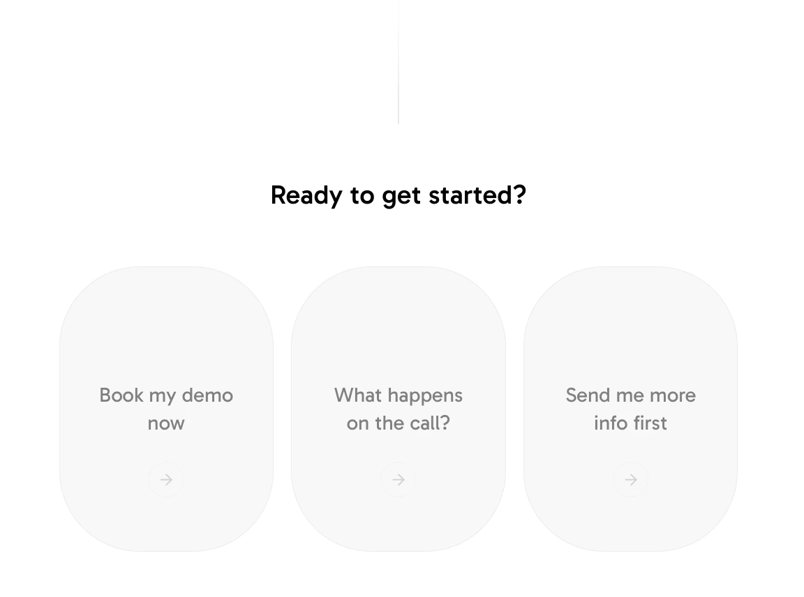 Best Used For: Enabling conversation continuation and user interaction.
- Presents a question with 2-4 selectable options
- Each option has a label and action
- Qualifies users by gathering information (company size, needs, budget)
- Dynamically routes users to appropriate content paths

